digital art: reach (yellows and purples in space)

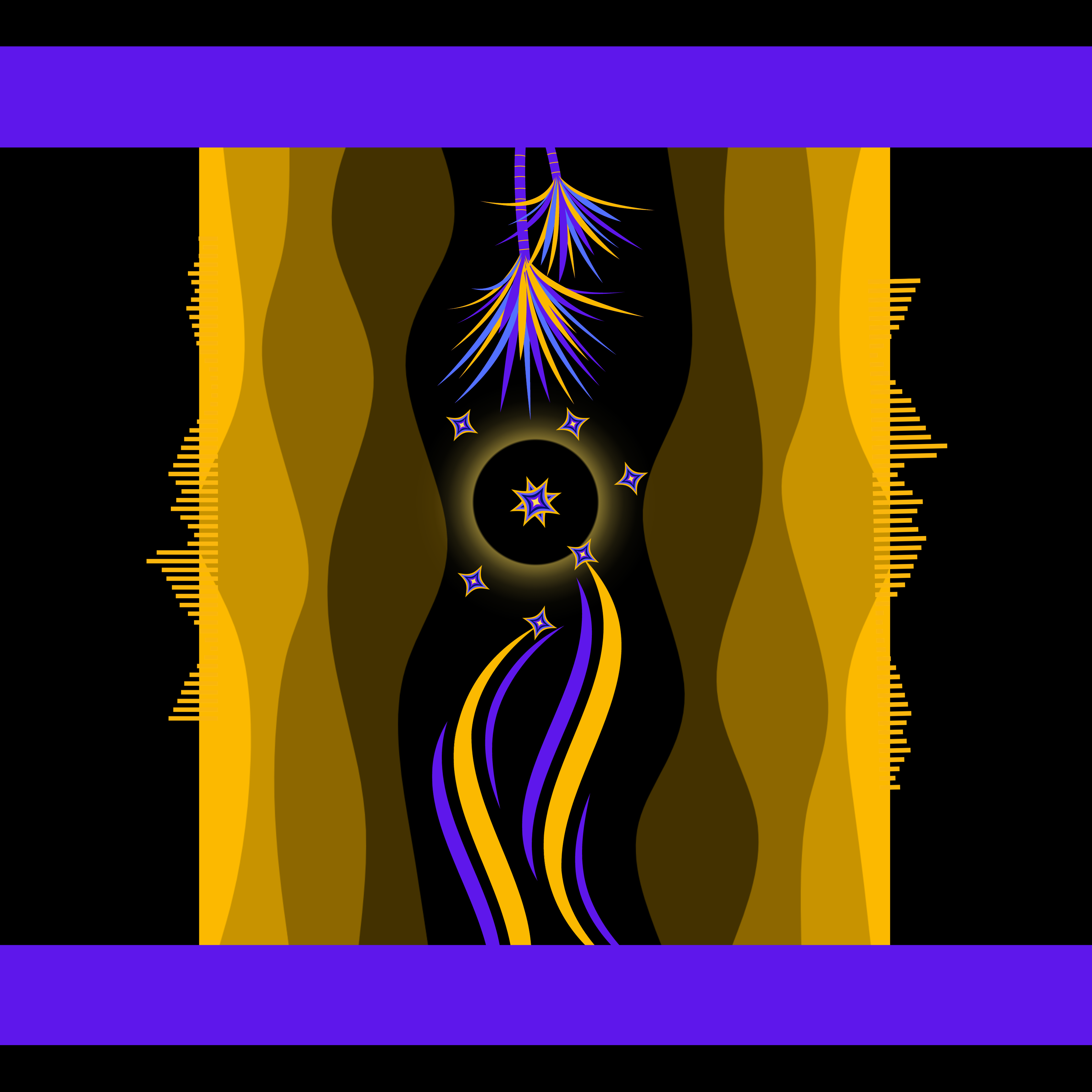
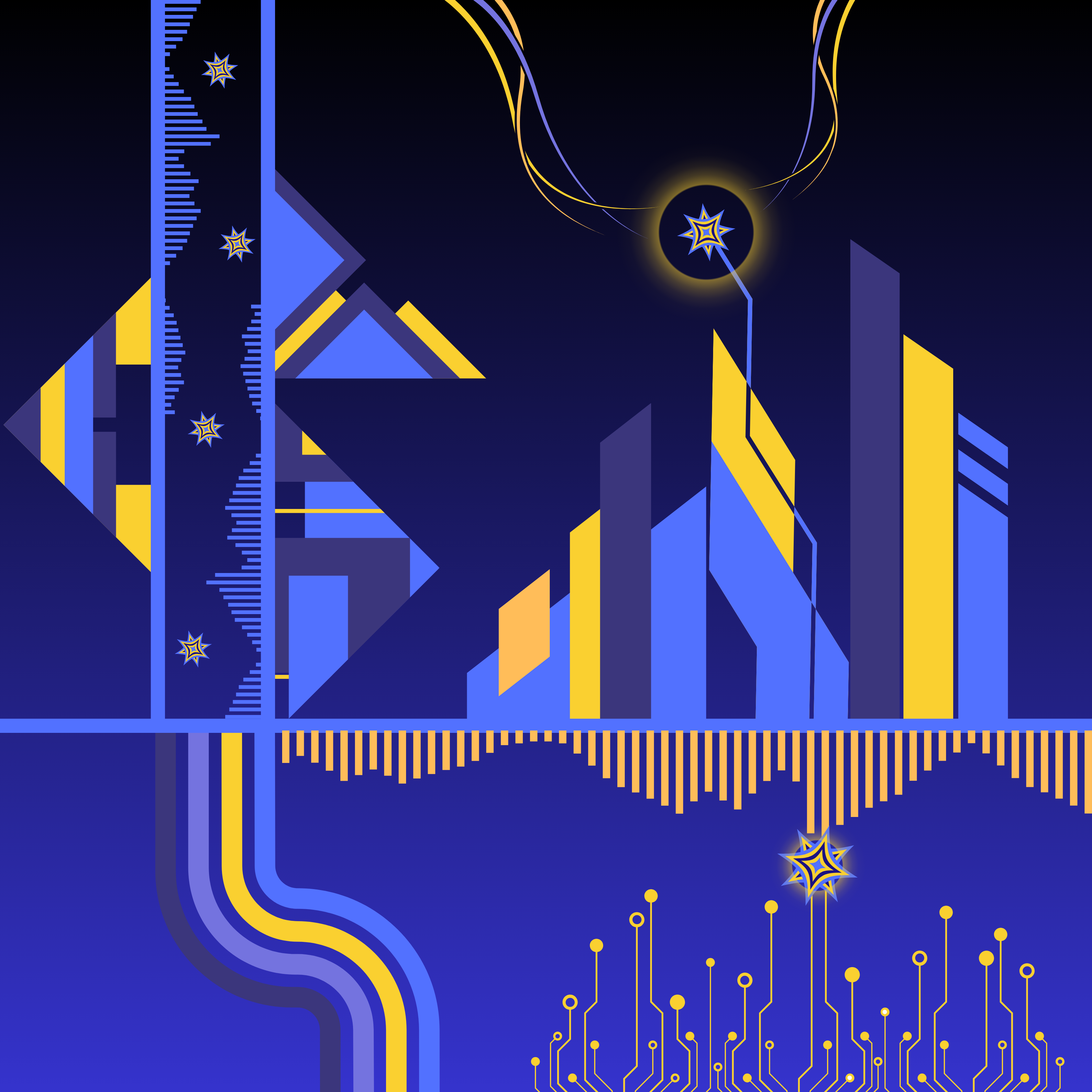
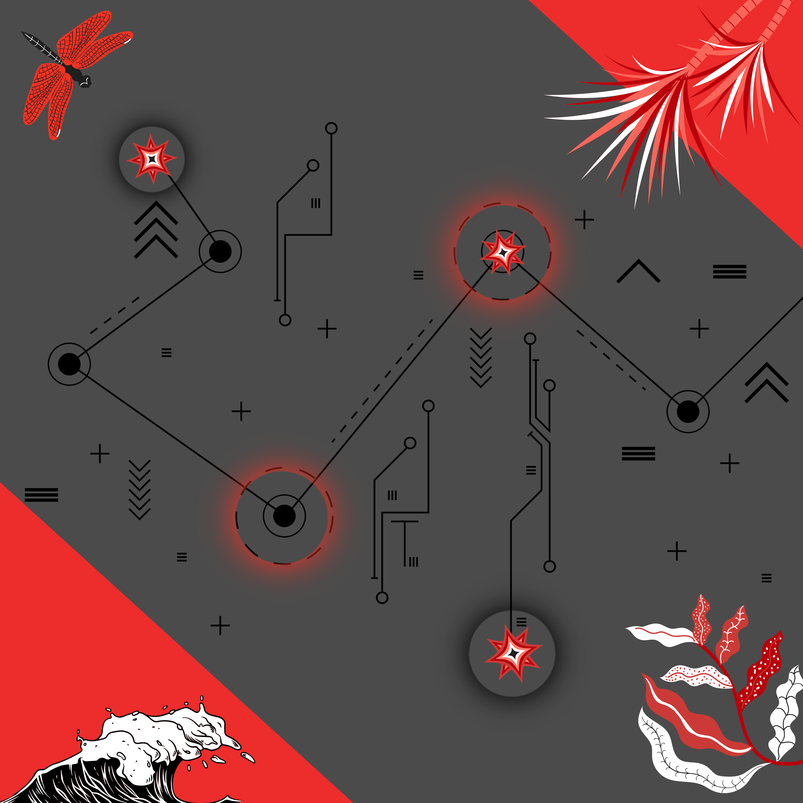
I have been enjoying this combination of colors lately (black, yellow and purplish hues) so I thought I’d share this odd creation. I liked the movement in this one, so I called it “reach” for some reason:

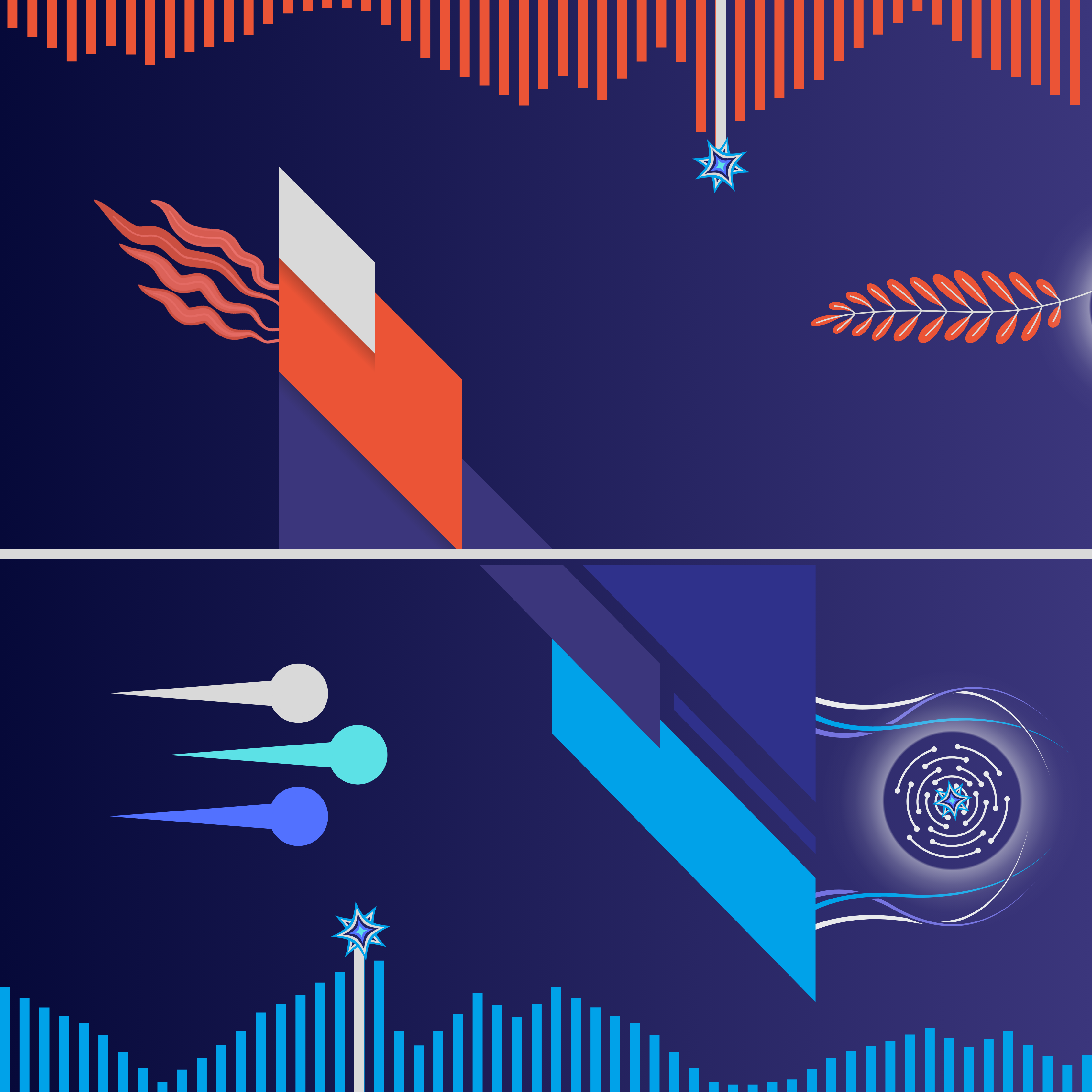
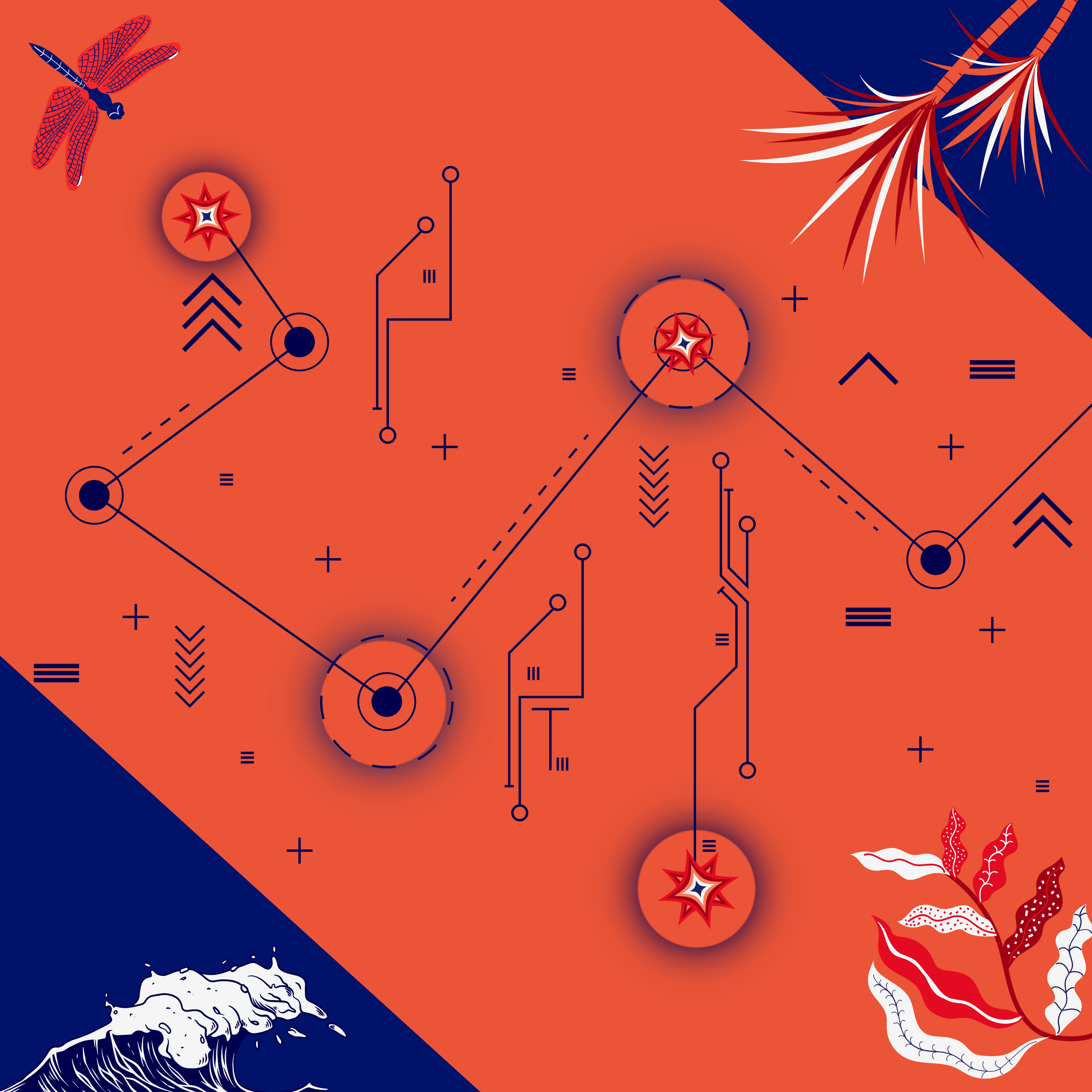
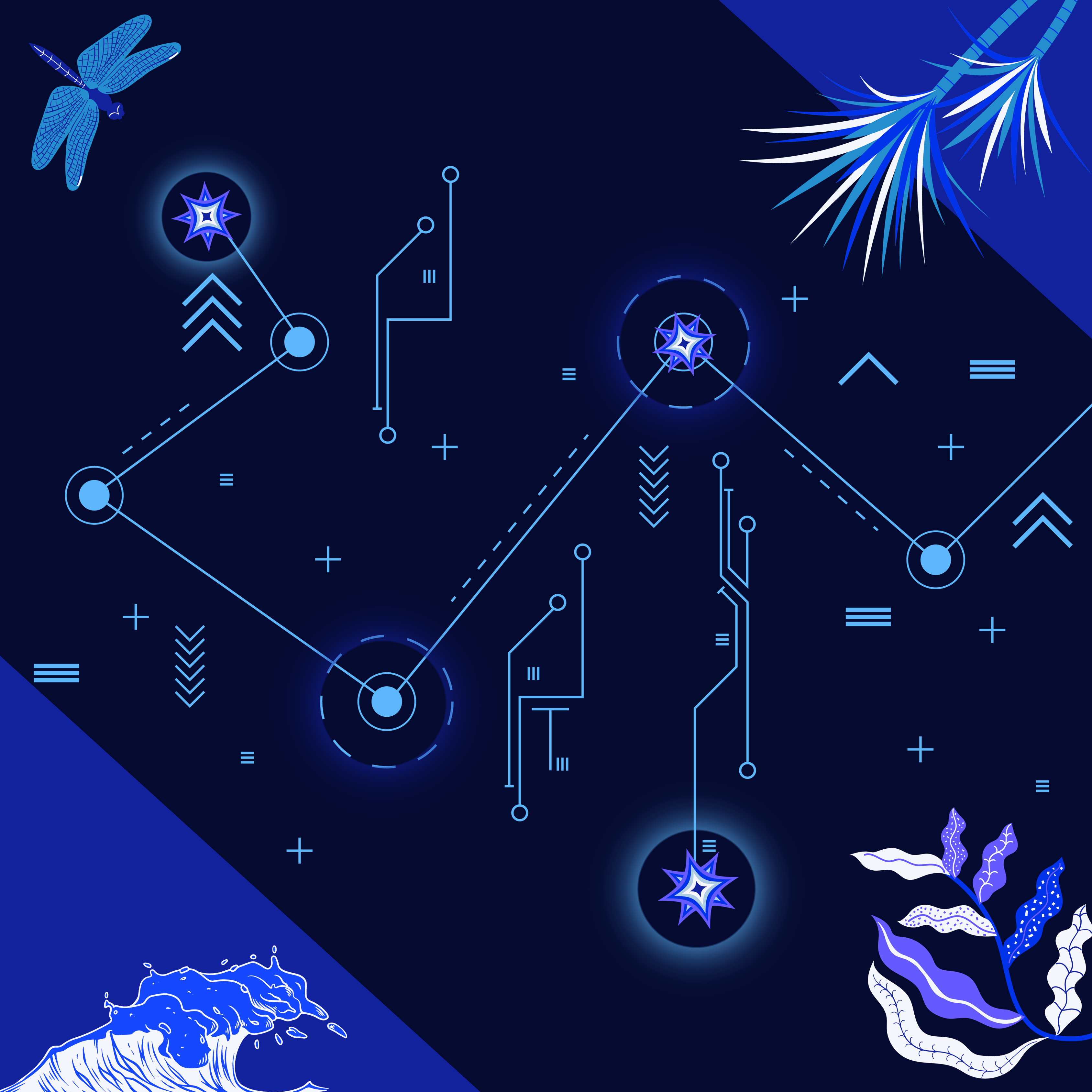
I couldn’t decide if it needed more of a border/outline, so here’s an alternate version:

digital art: I can feel the floes (icebergs and ocean depths)

I have been playing around with this one for a few weeks and decided it’s good enough to post. The name is taken from a song by the Disco Biscuits called “Floes“, which was written by their original drummer Sam Altman about the Northern Lights. That vibe just felt right for this one:

digital art: more fun with city vibes – “miami splice” vs “miami bleach”

I am still having some fun with the “cityscapes” designs and wanted to play around with some new color combinations. I decided that both of these had Miami Beach-themed color schemes and couldn’t decide which one I liked better.

“Miam Splice”

“Miami Bleach”

digital art: “lunchpad” – fun with bugs and electronics in purple hues

I have been toying around with this one on and off for a while and finally feel like it is close to “done.” In this one, I repeated some of the same electronic, circuit board themes from previous pieces, but this time, I added some “beings” to the mix.

lunchpad

digital art: “flown ablue” – fun with movement and blue hues

I have been doing some new takes on the “city” theme I started a few weeks ago with “City Boy’s Out of His Mind Again.” But for this one, given all the movement, “flying” vibes and blue hues, I decided to call it “flown ablue” (which is actually the name of my good friend Dave’s college band that I always loved). So, perfect time to give a shout-out to the David B. Smith Gallery in Denver (which was started by said Dave).

I actually can’t decide which version I like better, so here’s the alternate: