I created a new mix in the ‘just the jams’ style, combining a bunch of “blissful” segments of improvisation by the band Goose. Not only did it come out nicely, but it seems to have gotten picked up by the YouTube algo, as it’s getting a very decent amount of views/listens.
Tag Archives: abstract art
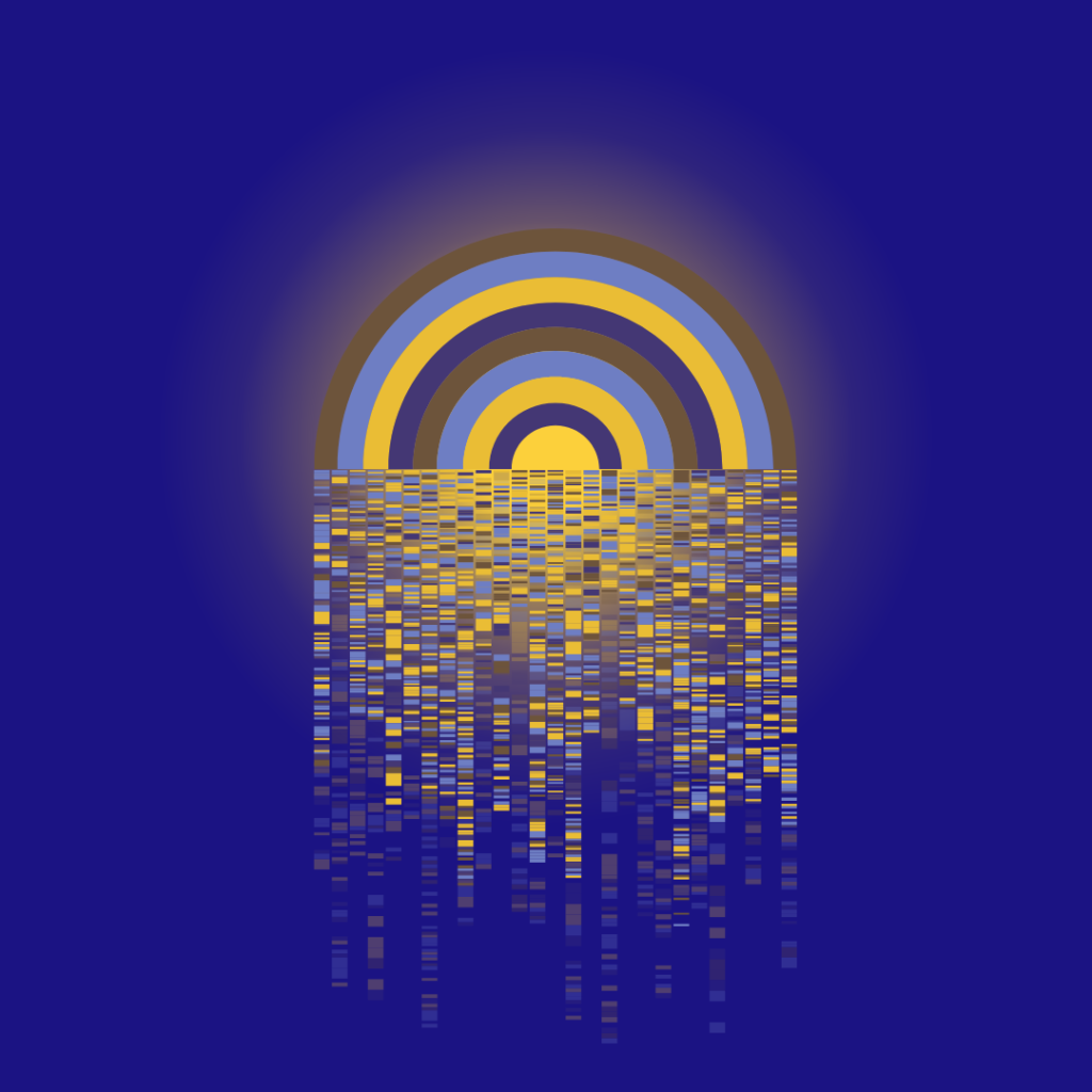
digital art: fun with rain and rainbow shapes with “rainglow”
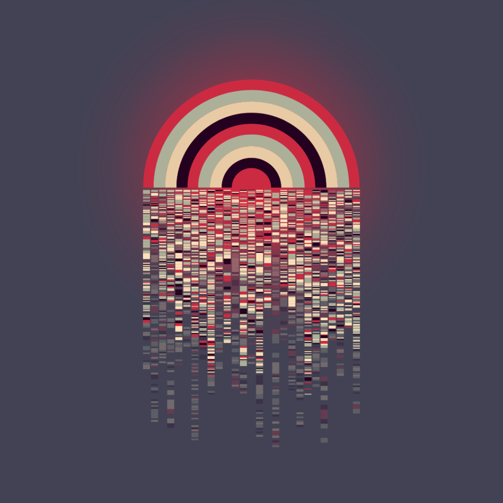
I recently put together this combo of a non-ROYGBIV rainbow and a matrix-like geometric cascade shape that I just love. It has so much movement implied even though it is not moving. I added a little glow behind it to fill it out a bit, and I really like the way it came together.
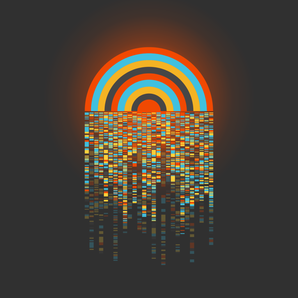
Here are some alternate color schemes, as I really had a tough time deciding on my favorite:
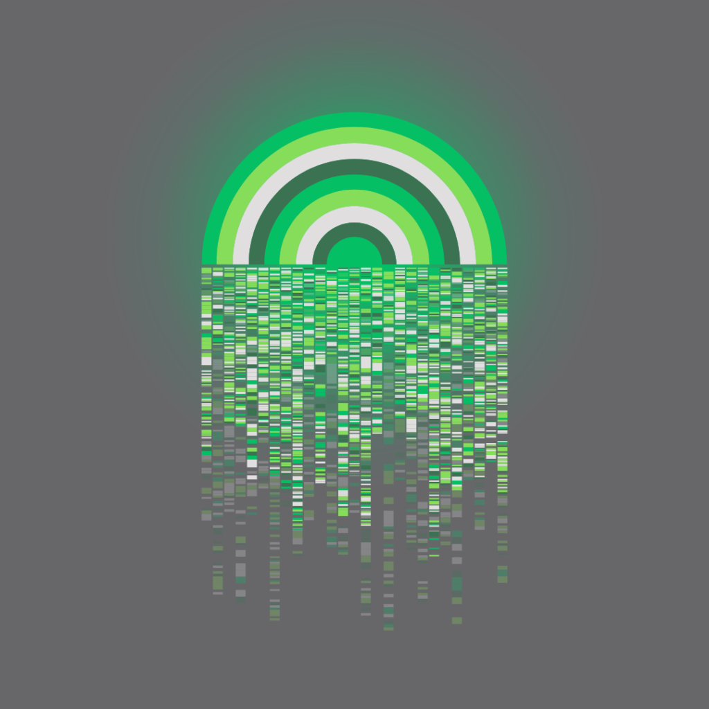
digital art: more of the grey and green color scheme with “pixel pipes and city stripes”
If you thought I was done with my obsession with the colors grey and green, I regret to inform you that you’re dead wrong. In fact, I did something a bit compulsive and bought some domains, and now I have something cooking over at thegreyandgreen.com with this as the top banner image:
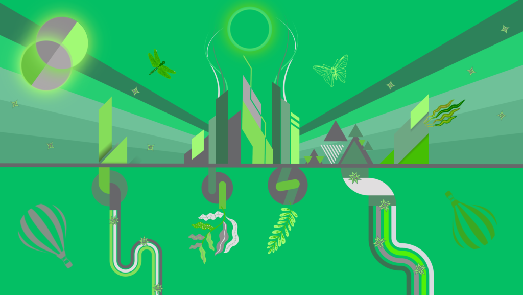
I’ll be honest, I don’t yet know what I am doing with this storefront. I had enough people ask me about my art creations (including some about buying prints) that I figured it’d be worth the experience of building my own little web store to test out the Shopify platform and see what comes of it.
This is still very much in the early stages, but I am going to gradually add more prints and products and see what happens.
If you like it, please consider helping me by:
- Sharing the link wherever you think is appropriate
- Joining the email list
- Buying something (if you feel so inclined)
If you do buy something, please let me know how the process goes for you. I’d recommend one of the mugs as a great place to start.
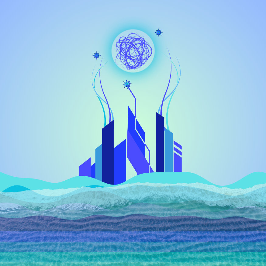
digital art: “beach city day dream”
As spring starts to turn to summer, I’ve got sun, sand and water on the brain, so it felt good to create imagery along these lines. I love the light blue colors in this one.
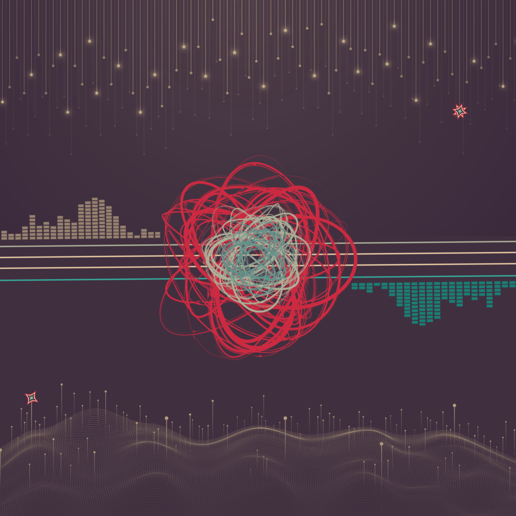
digital art: the flex capacitor
Lately I’ve been playing around with a lot of shapes and images that evoke energy and sound. This was originally in a black, purple and yellow (similar to “reach“) but then I found this grey color scheme with teal and red colors and just loved it. Most will know this, but just in case, the name is a nod to the “flex capacitor” from Back to the Future. heh heh.
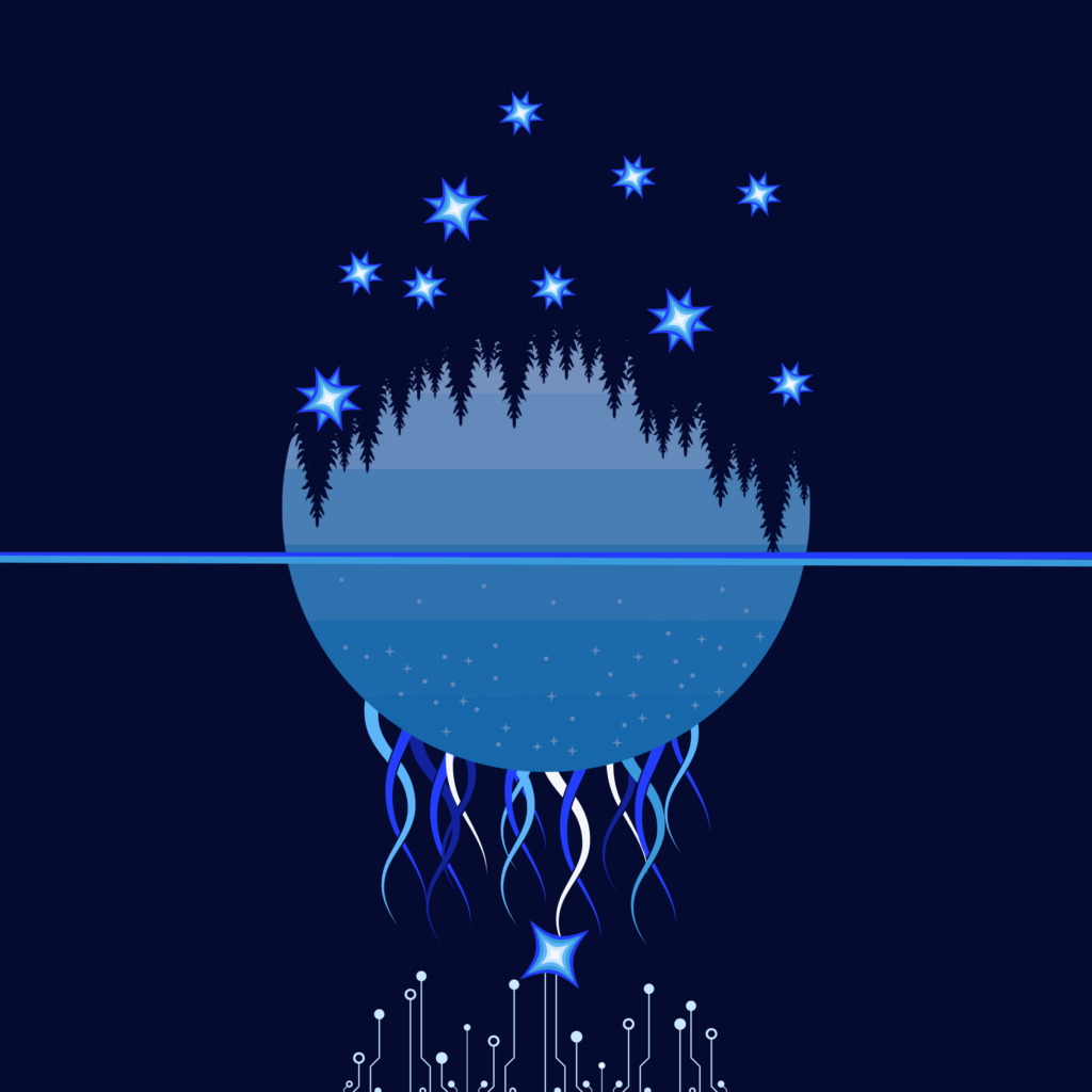
digital art: “pinecone valley”
For some reason, I’ve had this name in my head for a while, but never had anything that fit. I really like the squid-like tentacle shape (which I originally created in “squid gain“), so I recycled those here.
I still can’t decide which version I like the most, but the darker blues and purples seem to work best.
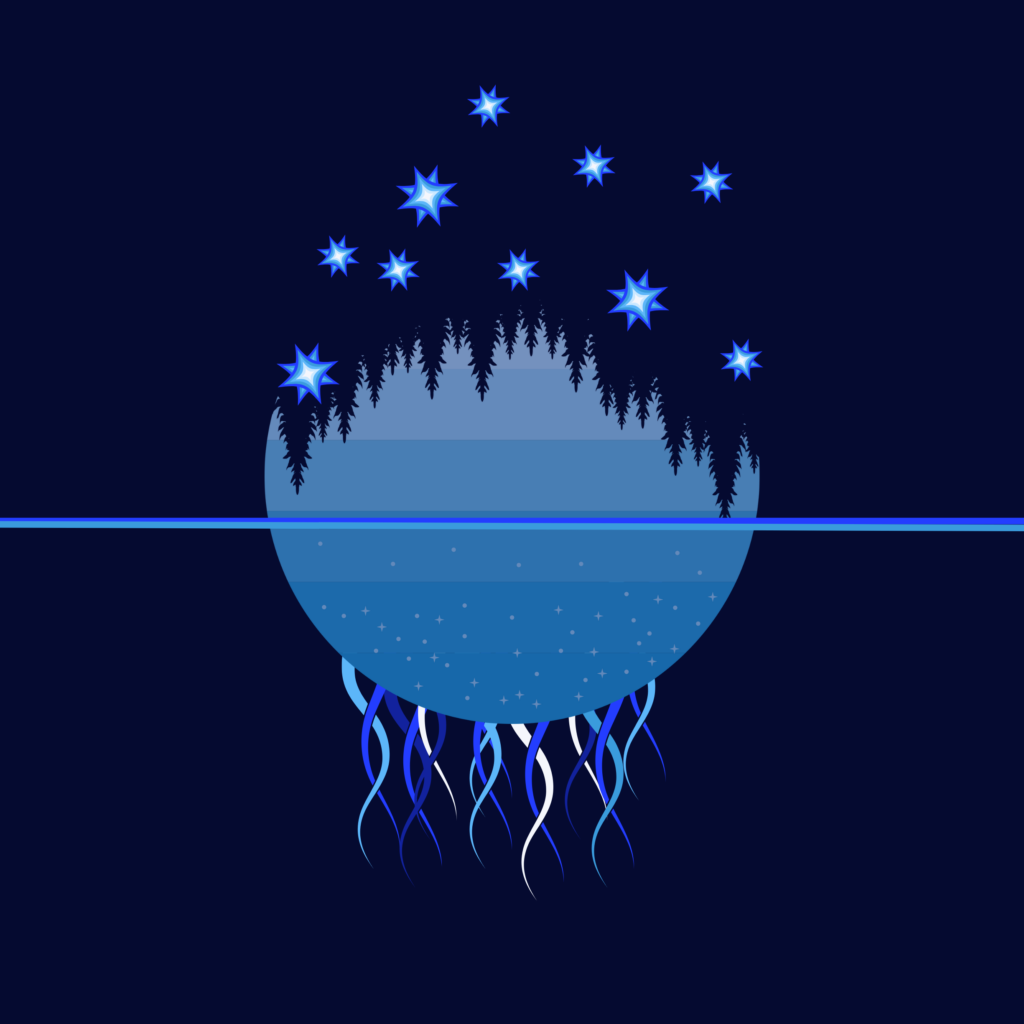
I also have a slightly simpler version:
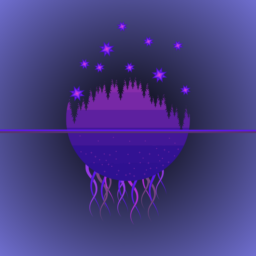
And then there’s the purple version:
digital art: the grey and the green quadrant
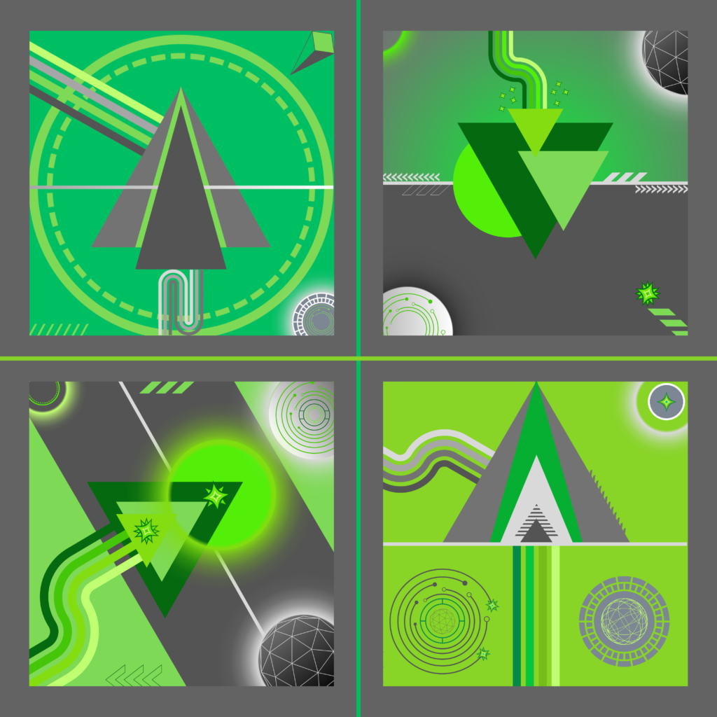
I thought it’d be fun to look back at some of my earliest attempts at this digital art thing, so I decided to recycle some of my original “grey and green” images and create a combination of them. I like this “quadrant” approach, and it’s especially fun to see where I started and compare it to my more recent attempts.

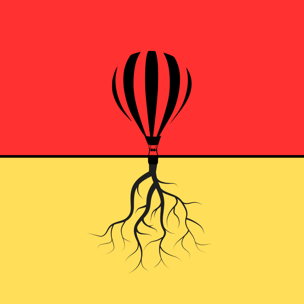
digital art: “hot lair balloon”
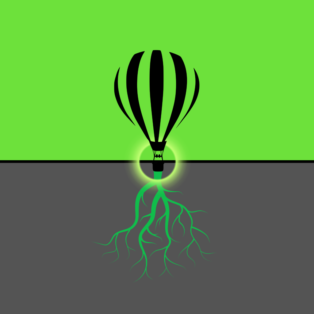
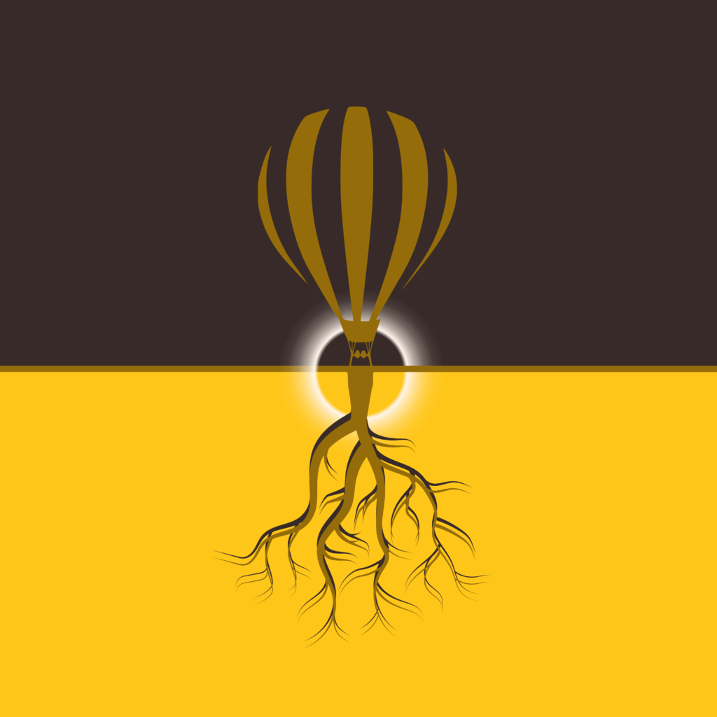
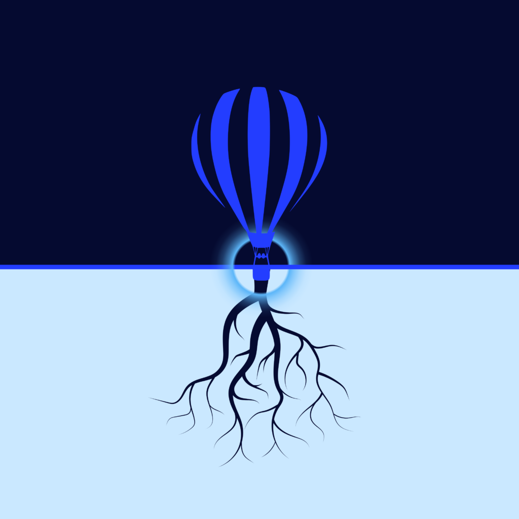
This one all started with me messing around with various trees and root images. I’ve had this hot air balloon image in one or two other pieces, but otherwise have not used it much. But I wanted something interesting sprouting out of the roots with some vertical motion. Using a normal balloon image wasn’t quite right, but this hot air balloon really hit the mark for me. I still don’t love the name, so I’ll change it if I come up with something better.

Overall, I prefer the green, grey and black color treatment, but I did end up with some other color variations I liked as well (all included below).

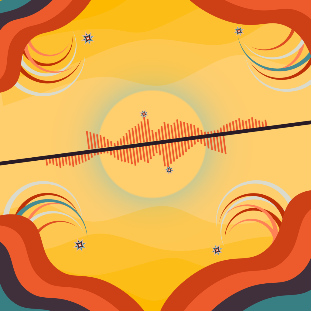
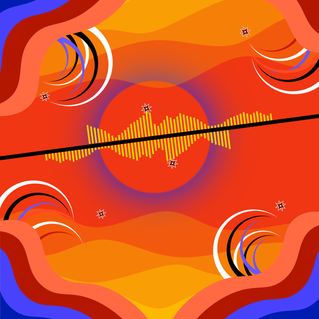
digital art: “sloth parsec” (space scapes and subtle sloth vibes)
I am really liking the dark space vibes these days. The name is a a play off of the look of the sloth-like “claws” mixed with an astronomical measurement, which, for me, is really just a Star Wars reference. 😉
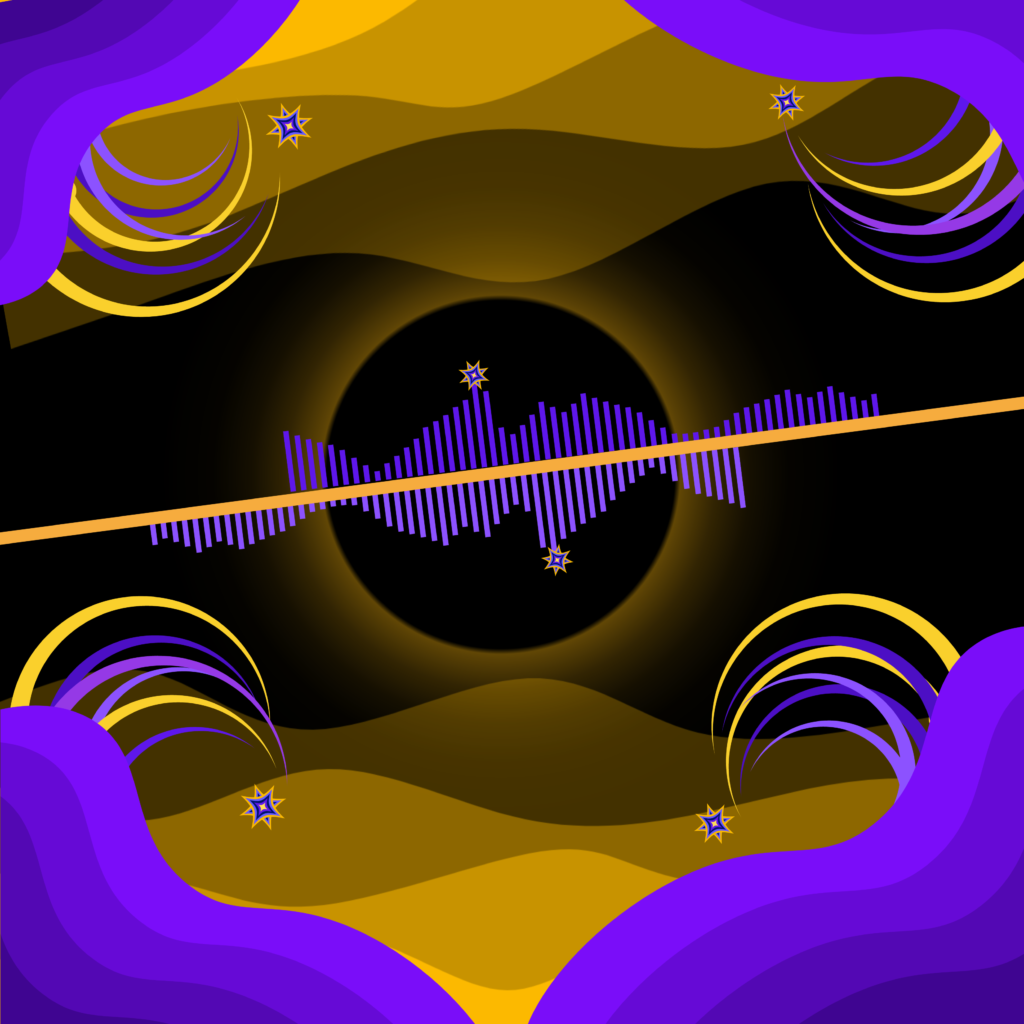
I definitely like the yellow and purple the best, but some of the other color combos are pretty cool too:
digital art: “the foist green organic”
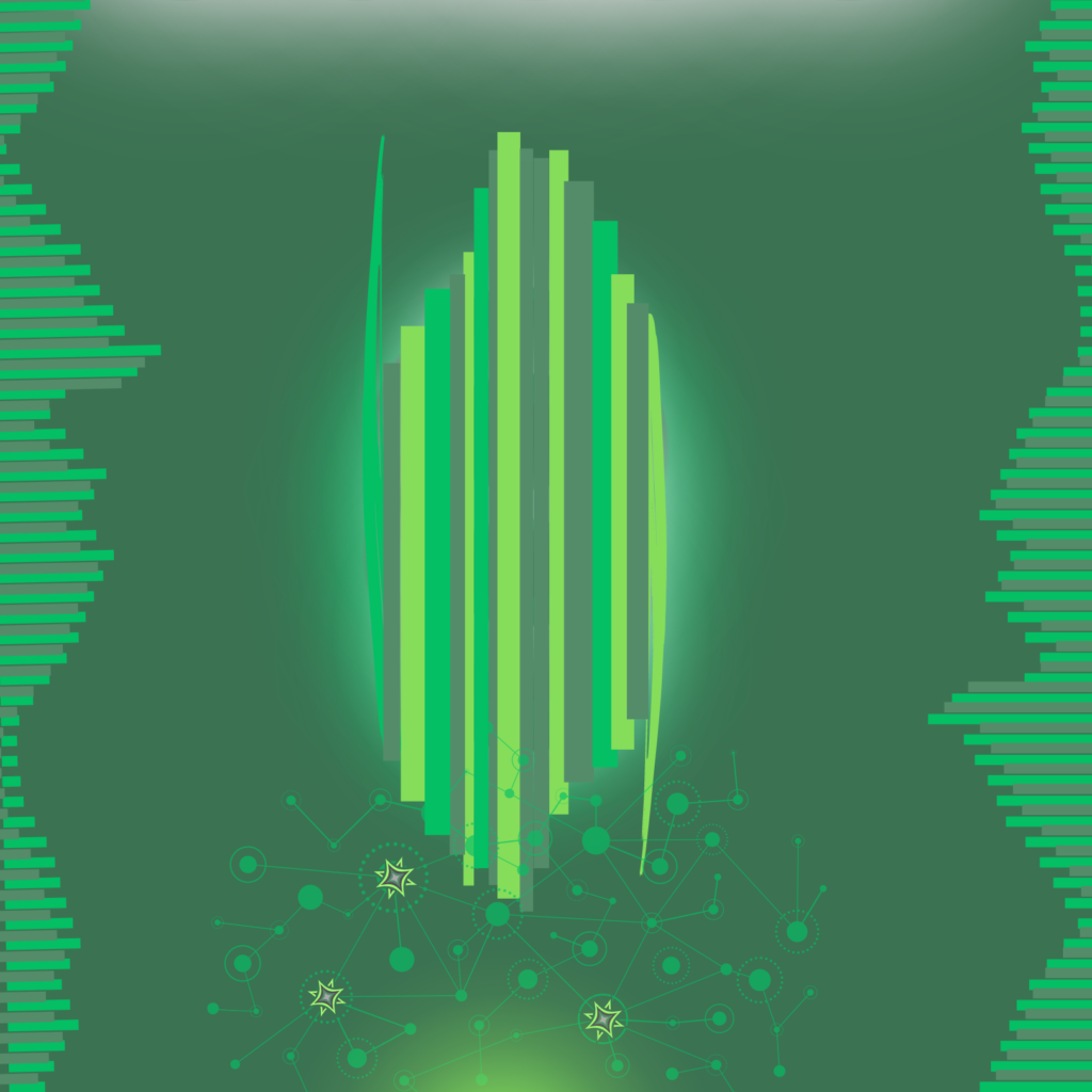
I decided to come back to some of the shapes I used in “neural net zero” but to recast them in a different way and new color scheme. This also combines some of the “grey and green” stuff I created a while back when I first got started.
Oh and the name is definitely a play on some of the lyrics from Phish’s “Lawn Boy” (and also partially inspired by the rest of the song, you know, “I can smell the colors”,”olfactory hues,” etc…).

While I like the way this came out with all green hues, I made a few other variations I like below.
