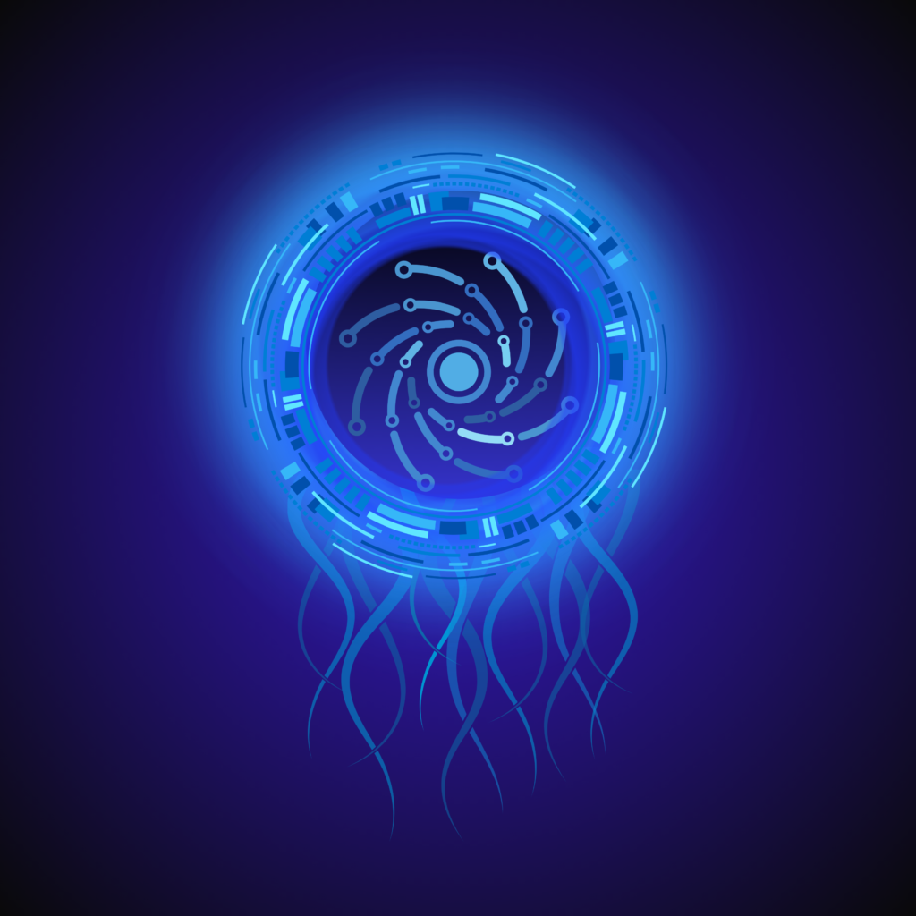
I am really liking these squid-like digital creatures I recently made. I especially like the way they look in dark, open spaces.
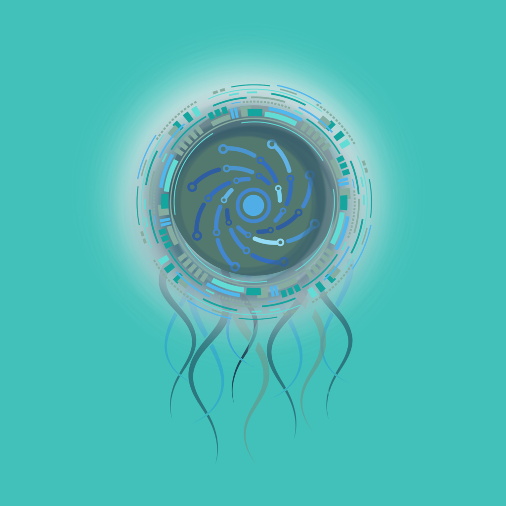
The above dark color is my favorite, but I also like this lighter blue treatment:
I am really liking these squid-like digital creatures I recently made. I especially like the way they look in dark, open spaces.
The above dark color is my favorite, but I also like this lighter blue treatment:
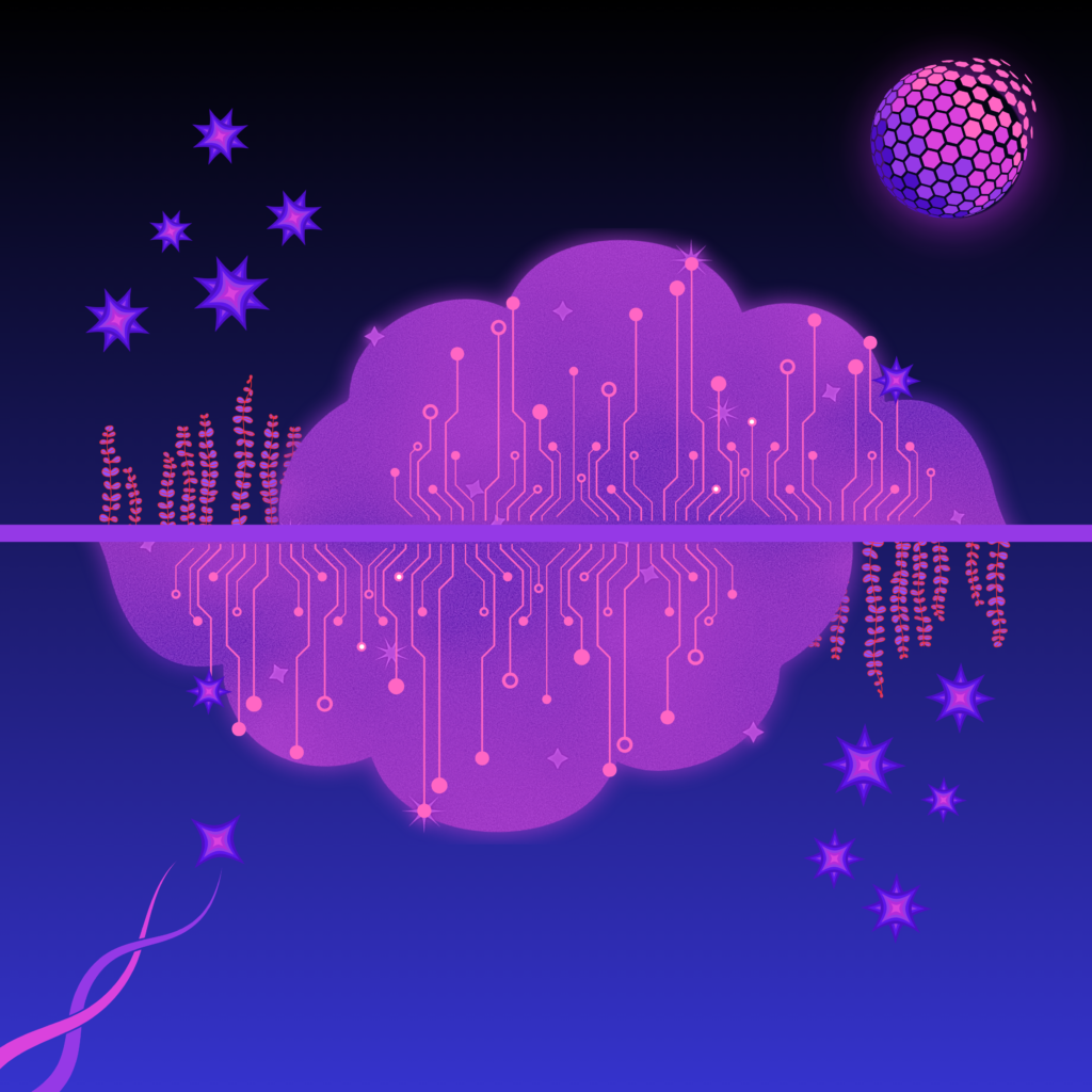
I don’t have much more to say on this one, but if you know about the pink cloud thing, then you have a sense for what I’m going for here:
I have been sitting on this one a while, trying to decide what to do with it, so why not just post it?
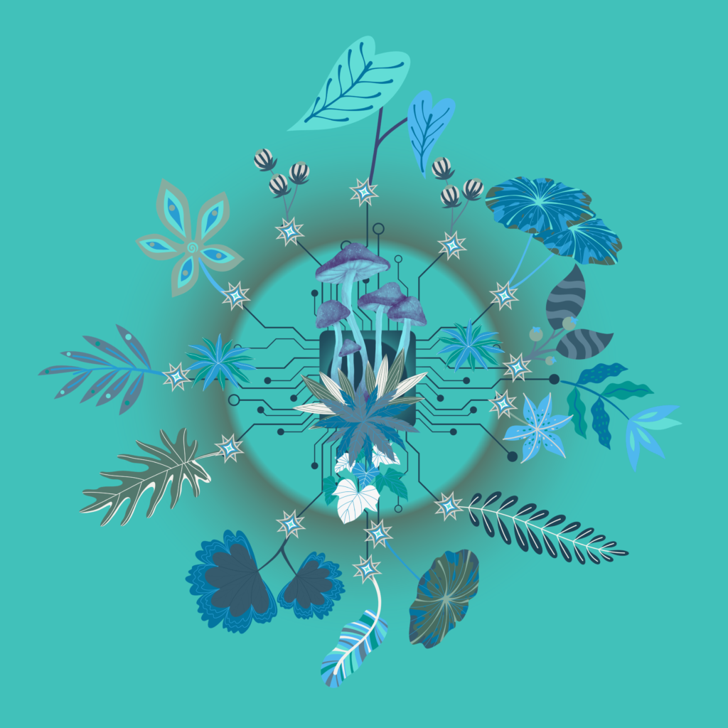
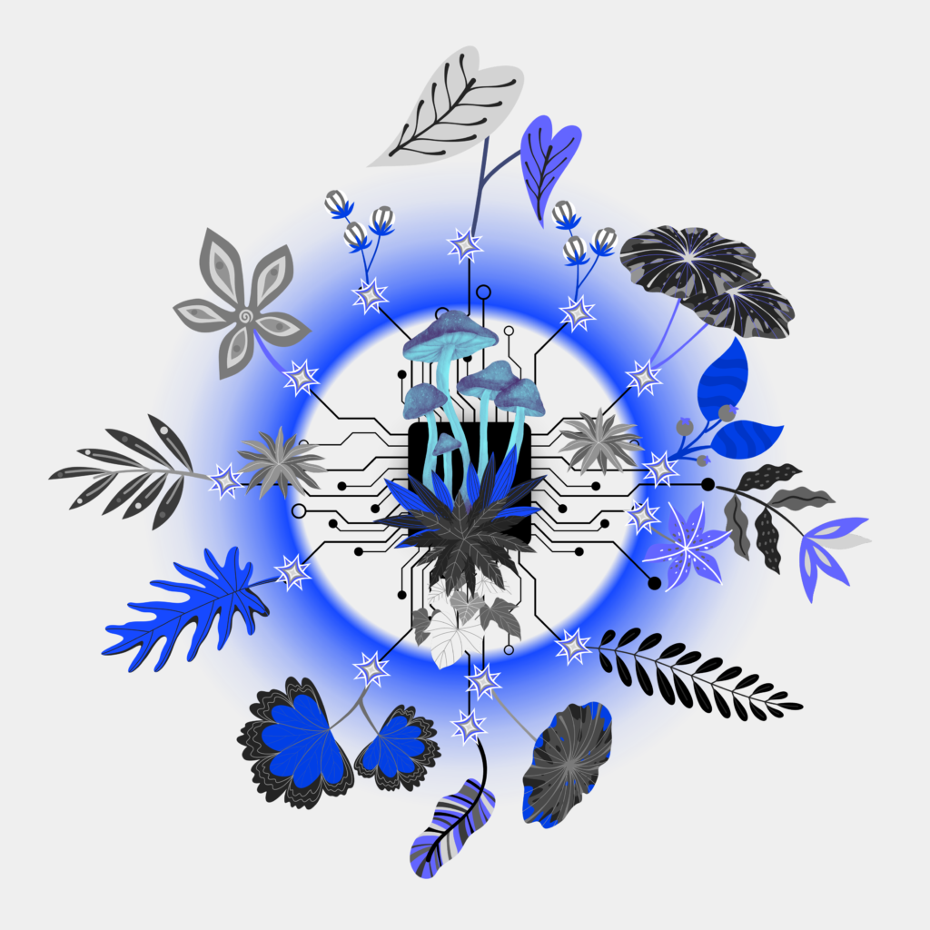
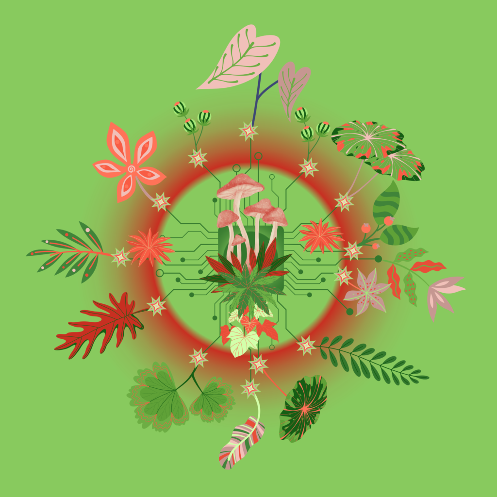
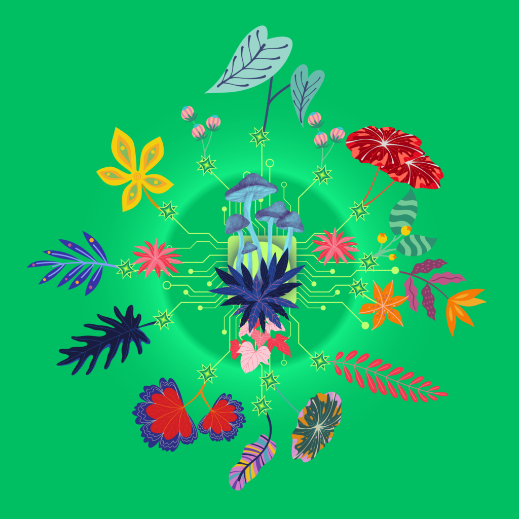
I am calling it “mycelial clock” but I also toyed around with “Digital Growth Source” as another name. I also can’t decide which color I like best so I am just posting a few combos:
I have been enjoying this combination of colors lately (black, yellow and purplish hues) so I thought I’d share this odd creation. I liked the movement in this one, so I called it “reach” for some reason:
I couldn’t decide if it needed more of a border/outline, so here’s an alternate version:
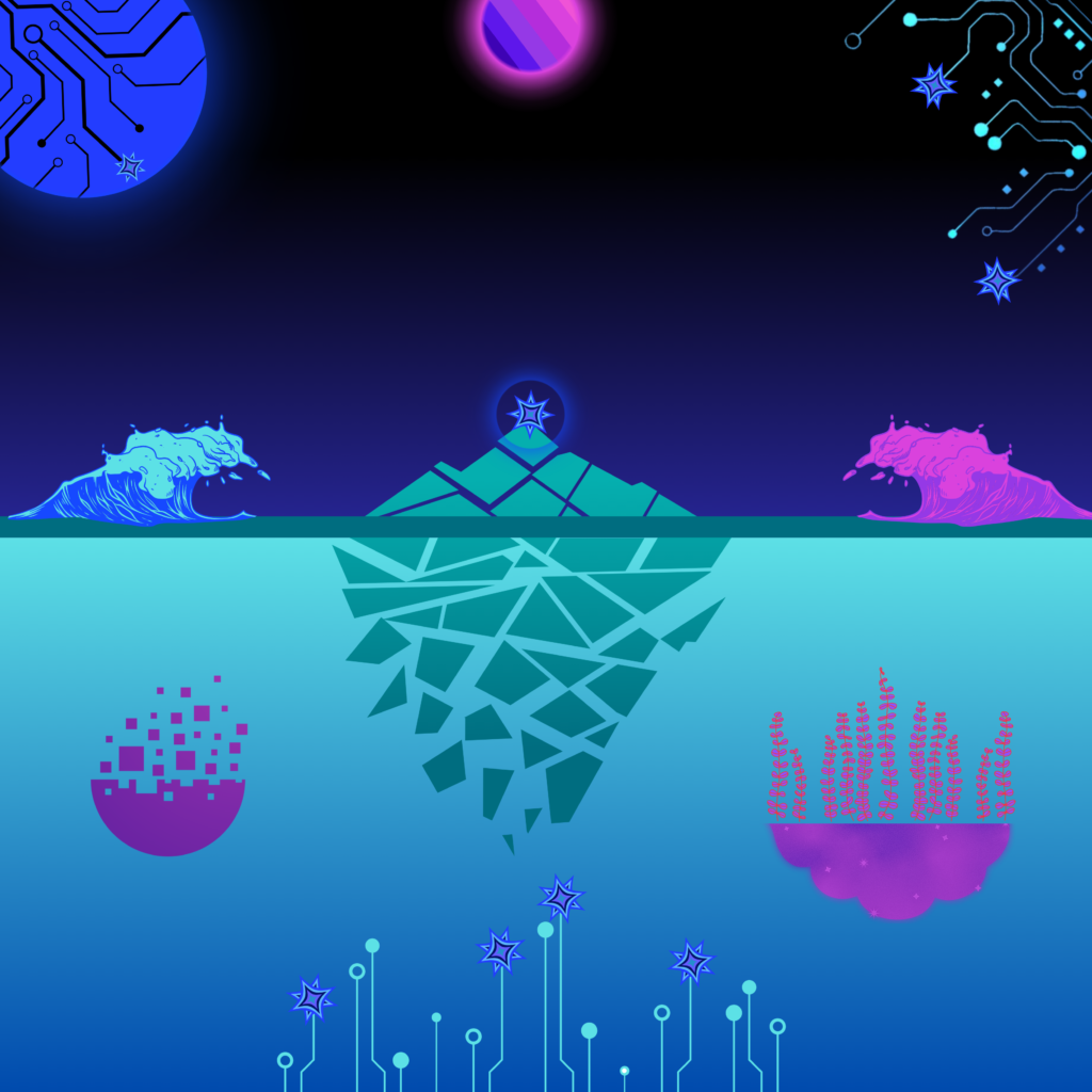
I have been playing around with this one for a few weeks and decided it’s good enough to post. The name is taken from a song by the Disco Biscuits called “Floes“, which was written by their original drummer Sam Altman about the Northern Lights. That vibe just felt right for this one:
I am still having some fun with the “cityscapes” designs and wanted to play around with some new color combinations. I decided that both of these had Miami Beach-themed color schemes and couldn’t decide which one I liked better.
“Miam Splice”
“Miami Bleach”
Some more fun with cityscape vibes, this time in blue and yellow hues. Given the city theme, I decided to name it after one of my favorite songs by the War on Drugs “Come to the City” (video below).
“Come to the City” by the War on Drugs (live):
I have been toying around with this one on and off for a while and finally feel like it is close to “done.” In this one, I repeated some of the same electronic, circuit board themes from previous pieces, but this time, I added some “beings” to the mix.
I have been doing some new takes on the “city” theme I started a few weeks ago with “City Boy’s Out of His Mind Again.” But for this one, given all the movement, “flying” vibes and blue hues, I decided to call it “flown ablue” (which is actually the name of my good friend Dave’s college band that I always loved). So, perfect time to give a shout-out to the David B. Smith Gallery in Denver (which was started by said Dave).
I actually can’t decide which version I like better, so here’s the alternate:
I’ve been having fun with these network-like elements and bar-chart style shapes this week and threw this one together last night. I love the different blue hues and how they come together in this one. It feels sort of ominous but also hopeful (kind of the way I view technological progress and AI right now).